|
What you need to know about your pastel painting: 1. My paintings are created using soft (chalk) pastels. They are applied to a high quality archival sanded paper. 2. While the sanded paper helps to hold onto the small pigment particles that make up your painting, some may be loose due to the amount of layering that is involved in one of my paintings. Because of this, anything that touches the surface of the painting can create friction, and can therefore pick up some of those pigments off the paper. In order to prevent damage, the surface of the painting must never be touched. It should also remain away from moisture of any kind. I create a custom shipper for each and every portrait to ensure that the painting does not get damaged on its way to you! When you receive your portrait, you will notice that it is shipped in a sort-of sandwich-like package. There is an outer layer of stiff cardboard to protect the package from getting punctured. Inside of that, there are two layers of white foam core board. These boards prevent the package from getting bent, and protect the portrait from the weight of having anything stacked on top of it. In the center of the shipping ‘sandwich’ there are tiny strips of board framing the portrait. These great a gap between the foam core board and the surface of your portrait, so that the two do not touch. Lastly, taped on top of your portrait is a sheet of clear glassine paper. This paper keeps the powder pigments where they need to be on the portrait as it gets bumped around. This sheet prevents any friction, should the outer layers of the package give in during shipping. How to unpack your painting: Use a razor or scissor blade to slice through the center of the packing tape around the edge of your package. Cut carefully, all the way around, to separate the top and bottom halves of the package. Be careful not to pierce the packaging beyond the tape - there is a very small gap between the packing tape and the edge of your portrait.(Note: there is one piece of masking tape holding the inner package together on each of the 4 sides of the package. ) 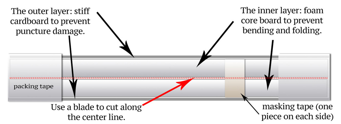 Once the packing tape is cut, pull the two halves of the shipper apart. (If it doesn’t want to open right away, be sure that those small strips of masking tape were cut as well.) Inside you will find your painting mounted to the inside of one half of the package, covered by a sheet of clear paper to protect it. (see diagram below) 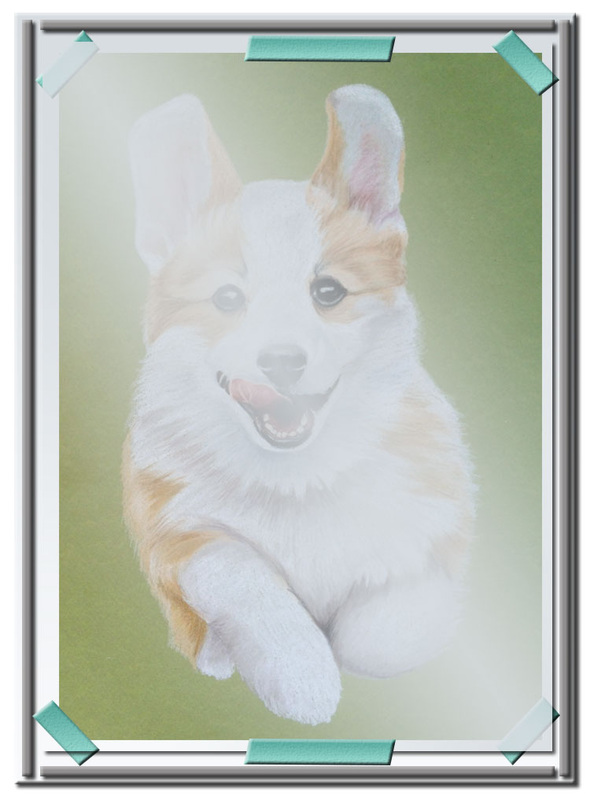 Carefully remove the sheet of glassine by removing the strips of masking tape that hold it in place. There should be 2-3 of these. You should be left with your painting, taped by the 4 corners of the piece of foam core board. Avoiding touching the surface of the painting, carefully peel off the tape that holds your painting in place. There is typically a small edge around your painting where there is no pastel - it is safe to pick up your painting in these areas. I would strongly recommend to keep your packing materials, as the surface will need to be protected until it is framed. How to frame/display your painting: I highly recommend working with a professional framer to help to properly preserve and display your portrait. Framers will be able to recommend frames and mats the compliment the painting, as well as the right materials to help preserve it. The painting should be displayed in a frame with a mat and glass. The glass is necessary to simply protect the surface. The mat is necessary, not just for display, but also to create a gap between the surface of your painting and the glass in the frame. Remember that nothing should touch the surface of the painting! My last equine portrait lent itself to illustrating the steps that go into one of my portraits. So I took the liberty of snapping some of the check points during the portrait process. I hope you enjoy the making of one of my custom horse portraits! 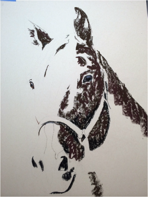
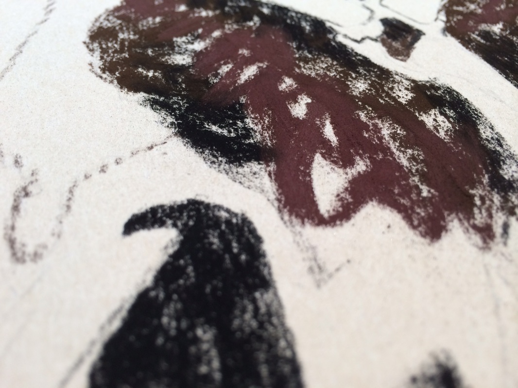
Above: blocking in dark tones with a variety of browns, reds, purples, and some black Below: some close views of the scribbles of pastel
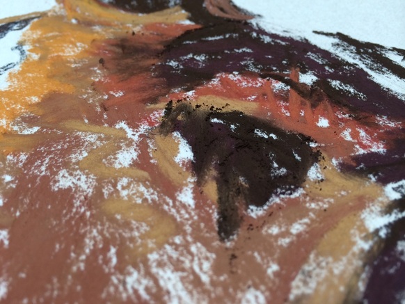
Above: Almost all the base color is laid onto the paper. This is before I did any blending. 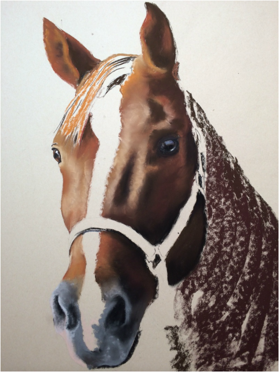
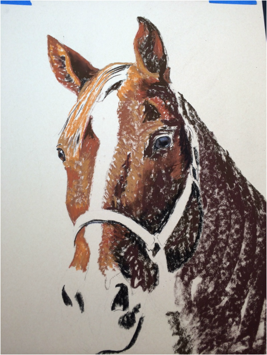
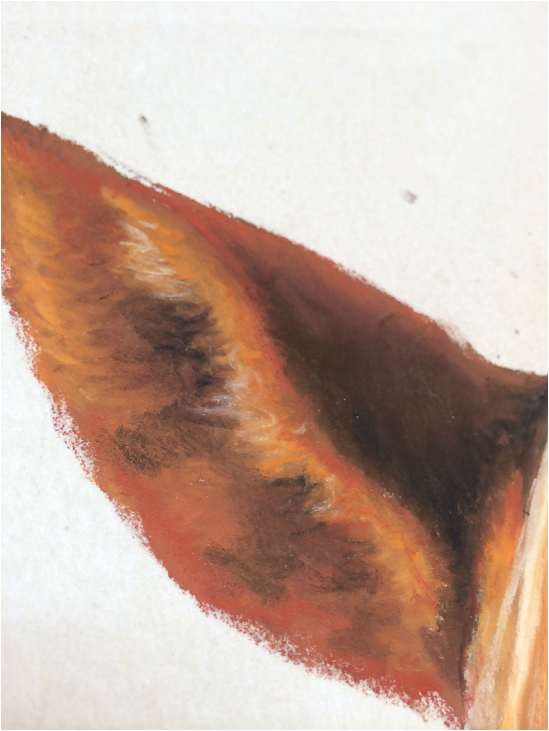
Above: I began blending large areas of the face. Still wasn't too concerned with detail. Just aimed to get the right colors and values where they needed to be. 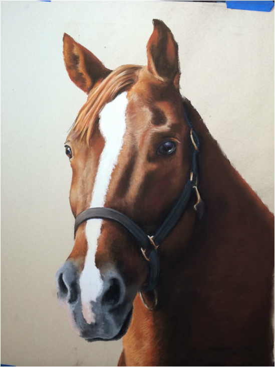
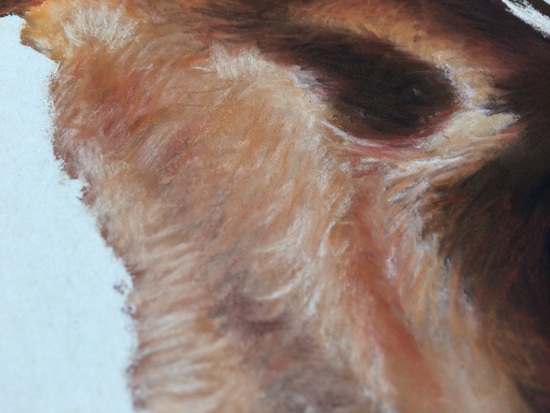
Above: Once all the colors are applied to the paper and blended correctly, I start to apply hair texture over the base layer. Below: Close-ups of the hair strokes of color. LOVE THOSE WARM TONES!
Below: I added a background that complimented the warmth of the horse's coat. 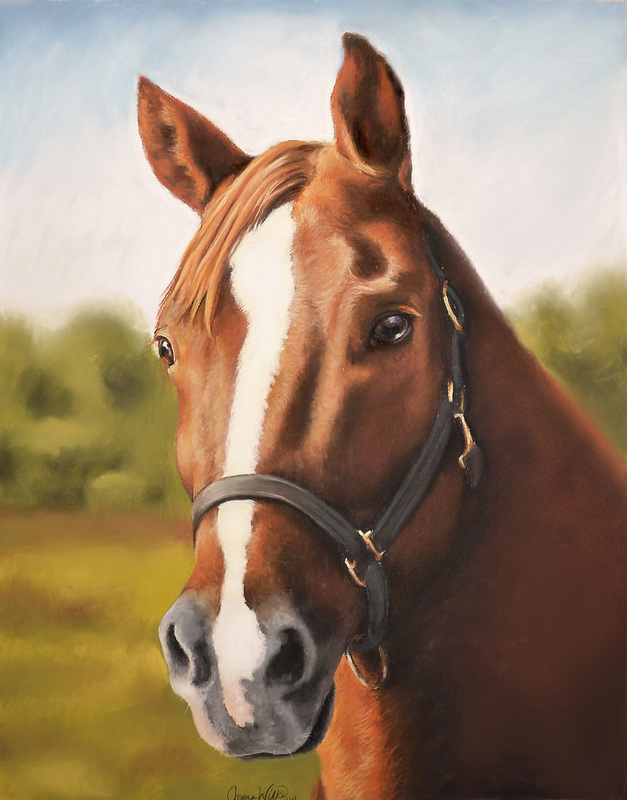
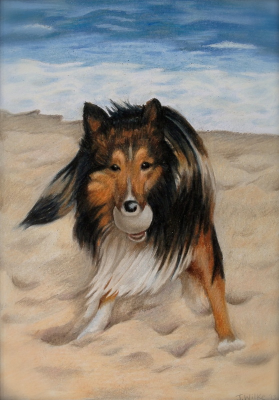
The finished product:
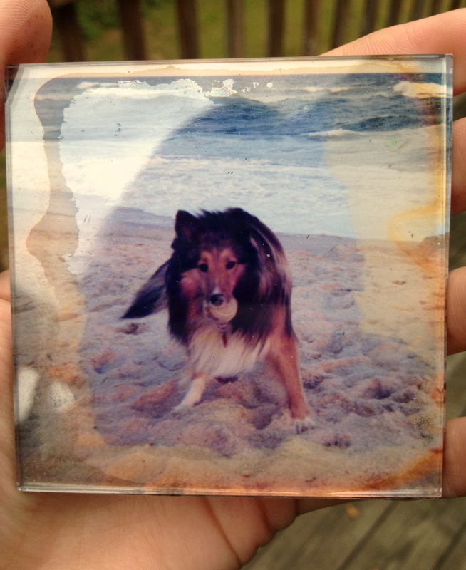
"Sanuk" 16 x 20 pastel horse portrait on archival sanded 400 paper. Original artwork by Jenna Wilke I find myself saying the same thing to most of my clients. "The better the photo is, the better your portrait will be." I cannot stress this statement enough. Pet portraits from Imagine Art are mirror images of your photo. While I wish I could, I cannot envision what your pet looks like in the detail necessary for a portrait. Therefore, it is very important that you provide a photo that follows these guidelines: Guidelines for Portrait Photos1. Your photo must be one that uses either A. natural light or B. was taken in a photography studio. Natural light means that the photo was either taken outside in the sunlight, or it was taken indoors next to a window where the sunlight came in. If you have access to a friend with a photography studio, or studio lamps, that is also acceptable. 2. The photo must show details such as hair texture, and eye color. This means the photo must be:
3. The photo must not have been taken with a Flash. No exceptions. To be explain what all of this means, take a look at these images. Blurriness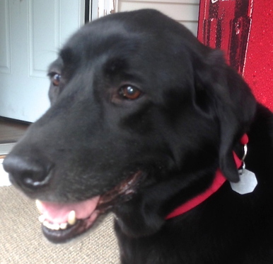 This image was taken outside in natural sunlight, which is good. It was also taken very close to the dog's face, which is also good. However, the image overall is blurry, and therefore is not the best for a portrait. Camera Flash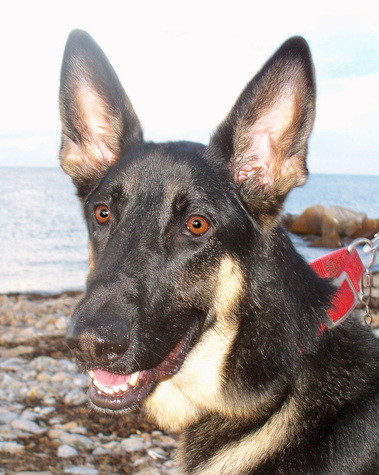 This photo was taken outside, which was great. It had potentially great scene in the background as well. However, there was not enough daylight here, and therefore the automatic flash went off. Flash gives false detail and flattens the texture. It also dulls the colors and makes for an overall unappealing portrait. Indoor Lighting with a Camera Phone Indoor lighting has many downfalls. While this photo doesn't use a flash, the indoor light was very warm, and therefore distorted the colors of the hair. Also, low light will render a blurry image. This photo is also grainy - due to the low resolution of a camera phone. To help you better understand what an appropriate reference photo might look like, here are some examples. Close with lots of detail! Perfect view of Eye to Eye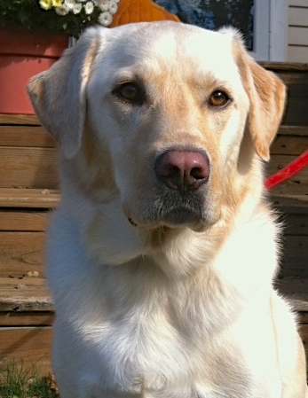 Indoor photo with Natural Light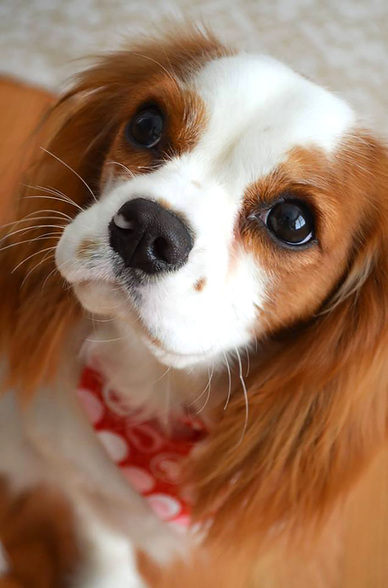 Thank you so much to everyone who participated in my second pet portrait giveaway contest! I received HUNDREDS of photos of all your fantastic adorable pets. It was VERY difficult to choose the winners. (REALLY!) FIRST PLACE: JENNIFER MOSS CHAPPELL "Paisley" Recipient of a FREE 12 x 16 pastel portrait! 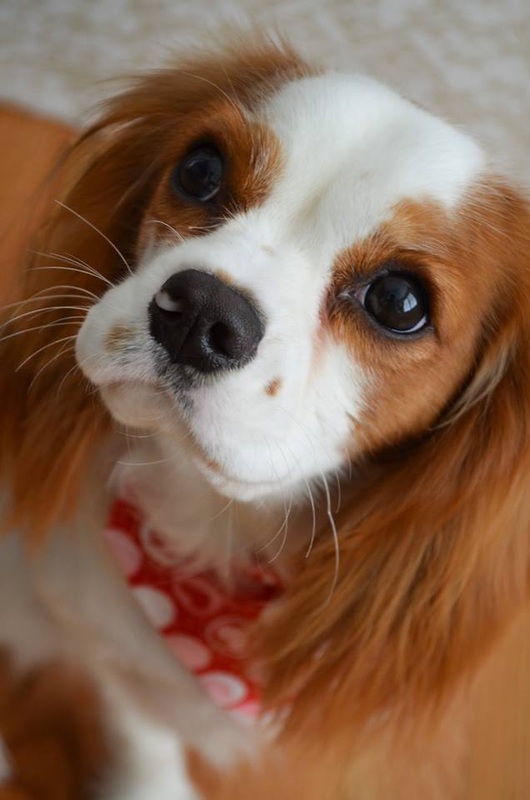
This photo is undeniably adorable, but beyond that, this photo stood out to me for a number of reasons. The photo is clear, bright, and close! I can see the texture in Paisley's hair, and the light in her eyes! She has tons of emotion, and this photo will yield and AMAZING portrait. Congratulations Jennifer! SECOND PLACE: SAMANTHA DICICCIO Recipient of a portrait at half price! 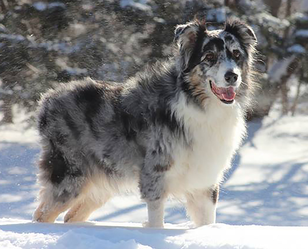
This photo is an amazing work of art. The colors and textures are vivid and bright. I LOVE this dog's markings, the expression on his face, and the excitement he portrays. The background and setting only add to the portrait, as he seems to almost camouflage himself into the scenery. I rarely even consider the scenery as part of a portrait, but this photo offers something I cannot pass up. Congratulations Samantha! As a thank you to all the participants in my contest,
Think your pet has what it takes to be an Imagine Art model?! |

  |  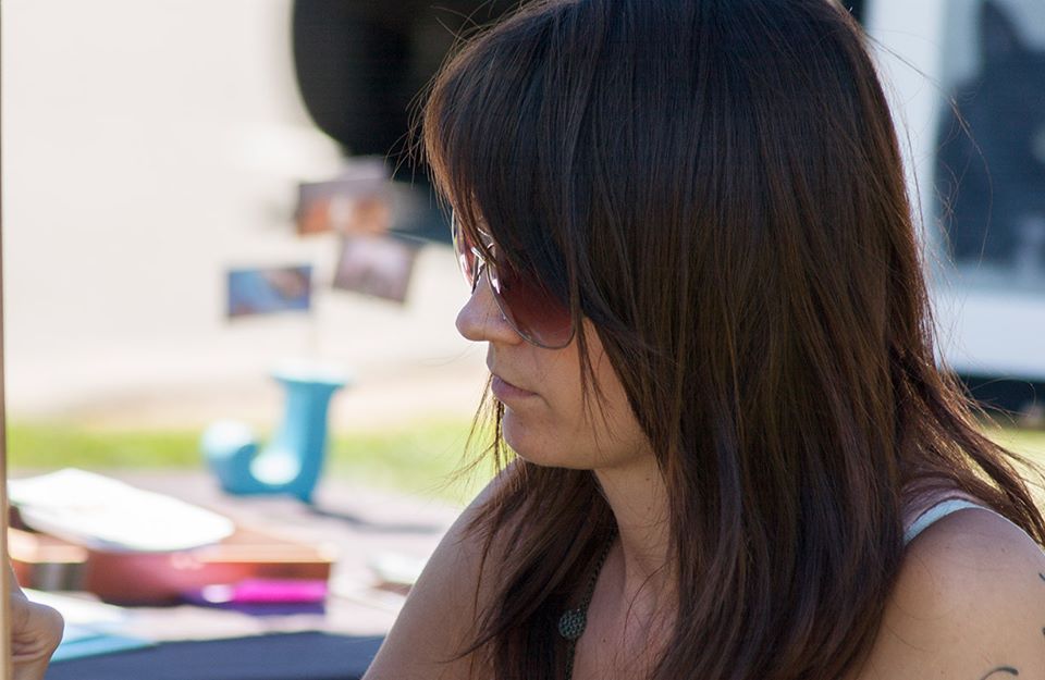 | 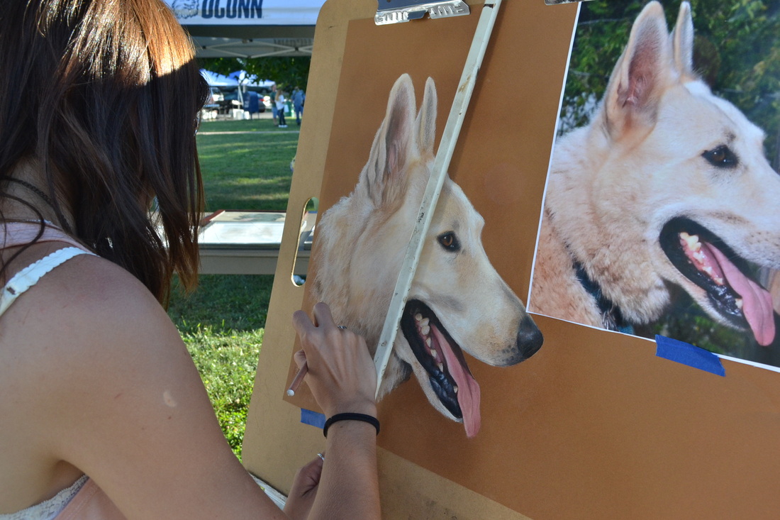  |
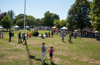
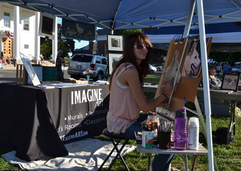
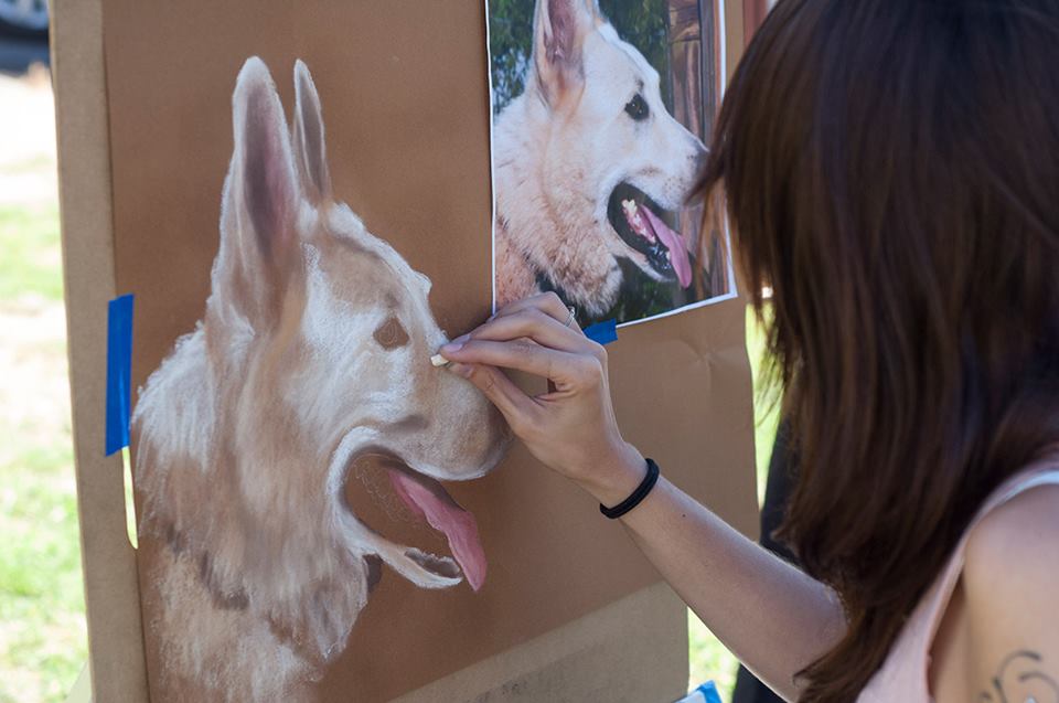
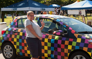
I also got a visit from a dog named "Diamond" who is Samson's (my portrait on the easel) lover. Since Samson's portrait is a surprise gift, the dog's owner was in awe over the portrait. It was a great twist on the day.
Since my audience enjoys the horse portrait process, I decided to start filming my portraits, in progress. My YouTube channel has tons of "Speed Drawing" videos. These are recordings of portraits, from start to finish that were sped up and edited to be about a minute long. Thank God for my amazing fiancé, Adam who does spectacular work with video editing!
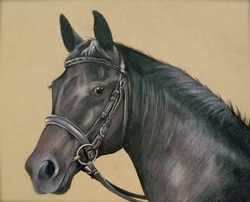
This is a portrait I did recently of a beautiful Oldenburg mare named "Rohsina". Enjoy!
Zazzle has always been a favorite resource of mine. I found them years ago, and started printing custom calendars as Christmas gifts for family members. Since then, the company has grown tremendously, adding new items constantly.
The great thing about Zazzle is that you can customize anything to be exactly how you like it - with pictures, logos, text, anything! I've always been 100% satisfied with their quality also.
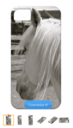
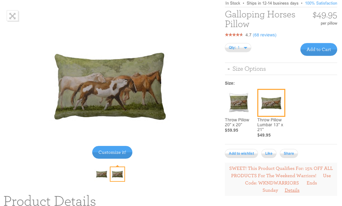
The Imagine Art store has a wide variety of items, ranging from kitchen towels and throw pillows to mugs and iPhone cases. Everything is customizable, so you can add your own text if you like. Images vary from my paintings and drawings to photography. If there's something you'd like to see, let me know.
Click here to check out my Zazzle Store!
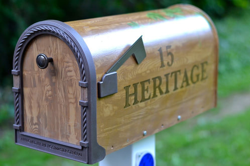
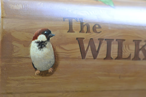
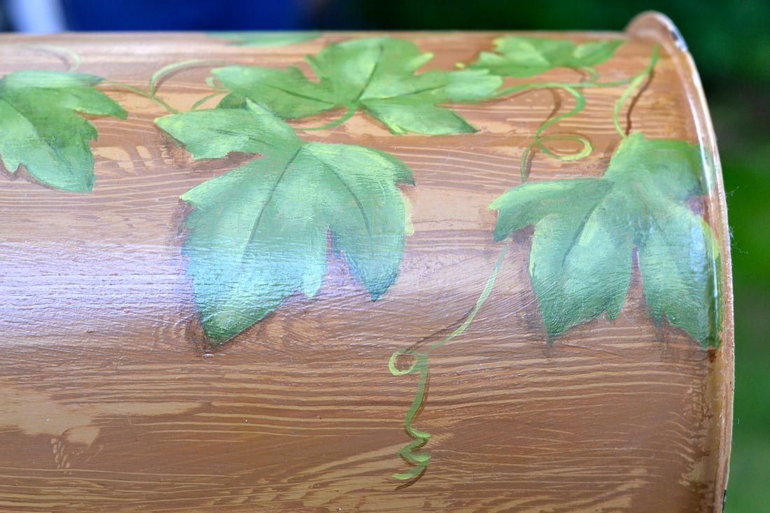
Stand out from the crowd with a unique custom-painted mailbox!
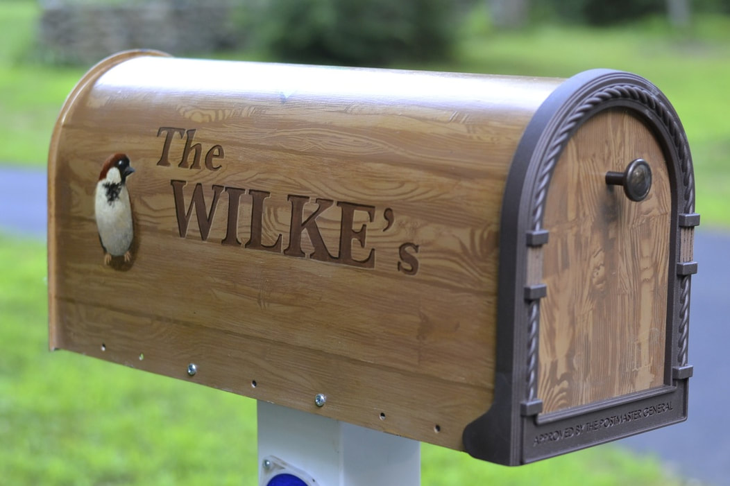
Design concepts will be discussed on an individual basis to determine exactly what look you'd like the mailbox to have. Each mailbox is hand-painted to suit your needs: add text, textures, floral designs, wildlife, family pets, silhouettes, custom graphic designs, and more! Each mailbox is painted with weatherproof fade-resistant paint and sealed with a colorfast urethane to ensure vibrance and longevity.
Custom mailboxes make a PERFECT for family and friends for any occasion. Custom mailboxes start at $220.
To commission your own custom painted mailbox, or for more details, please contact me!
 |  |
About me.
I eat, sleep, and breathe art. I'm fond of horses and put ketchup on everything. =]
Archives
August 2016
May 2015
January 2015
October 2014
August 2014
July 2014
May 2014
April 2014
March 2014
February 2014
January 2014
September 2013
August 2013
July 2013
July 2012
June 2012
March 2012
February 2012
October 2011
July 2011
May 2011
February 2011
September 2010
August 2010
Categories
All
Art
Art Show
Car Decals
Commission
Contest
Custom
Dog Portrait
Etsy Shop
Gallery Show
Horses
Horses Riding
New Site Imagine
Paier
Paint
Pet Fair
Pet Portraits
Photo Shoot
Printmaking
Prints
School
Summer
Thesis
Winter
 RSS Feed